KontrapunktBold font
Publisher
License
$ Free for personal use
Date added
Jan 10 2017
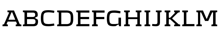
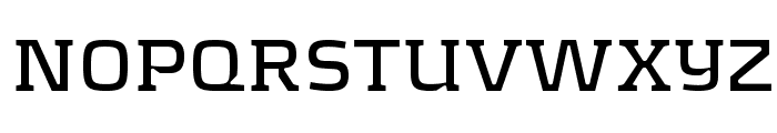
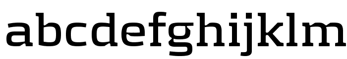
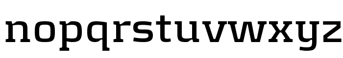
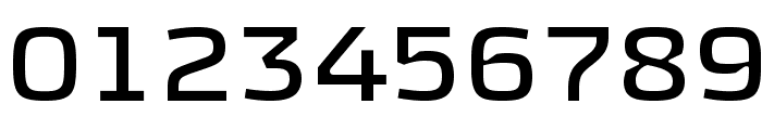
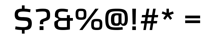
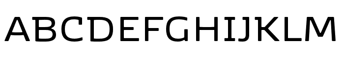
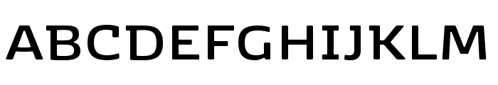
A modern, geometric font with consistent stroke widths and high readability.
This font features a clean, geometric design with consistent stroke widths and a modern aesthetic. The characters are well-balanced, with a focus on readability and simplicity. The uppercase letters are bold and assertive, while the lowercase letters maintain a uniform appearance. The numerals and special characters are distinct and easy to distinguish.
Ideal for branding, headlines, posters, and digital interfaces.
Headlines, Logos
Balanced
Download KontrapunktBold font. KontrapunktBold by Designed by Bo Linnemann Ð Kontrapunkt A/S. The font may be used and distributed freely Ð NOT FOR RESALE. www.kontrapunkt.com
Ideal for branding, headlines, posters, and digital interfaces.
Headlines, Logos
Balanced
(Fonts by www.kontrapunkt.com)
See the font with your own custom text

Category
Sans-Serif
Bold
Yes
Italic
No
Weight
Bold
Width
Normal
Character spacing
Normal
Line height
Normal
Contrast
Low
Overall style
Modern
X height
Medium
Cap height
High
Proposed projects
Ideal for branding, headlines, posters, and digital interfaces.
Use case
Headlines, Logos
Ascender descender ratio
Balanced
Similar Free Fonts for KontrapunktBold
KontrapunktBold Font

$ Free > Personal Use
Samton Bold Font

$ Free > Personal Use
Similar fonts for KontrapunktBold from Adobe.com
Kobenhavn SemiBold Font
$ Commercial > Adobe.com
Kobenhavn Bold Font
$ Commercial > Adobe.com
Similar fonts for KontrapunktBold from MyFonts.com
Diafragma Bold Font

$ Commercial > MyFonts.com
Kobenhavn Book Font

$ Commercial > MyFonts.com
Similar fonts for KontrapunktBold from CreativeMarket.com
Kirsty Light otf (300) Font

$ Commercial > CreativeMarket.com
Abula Thin otf (100) Font

$ Commercial > CreativeMarket.com


Help your fellow font-seekers if you think you can recognize the font. Earn some good karma by doing it :-) Answer & Help
Yet sometimes the images are very complex, so other users need a bit of help.
If you recognize the font from the samples posted here don't be shy and help a fellow designer.
Thousands of designers (famous or not) use the image font detection system to find a font or similar free fonts from an image. Although we have the largest database of fonts, the search for a font from an image gets mixed results like the image above.