
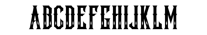
Quastic Kaps Line font
Publisher
License
$ Free for personal use
Date added
Jan 08 2017
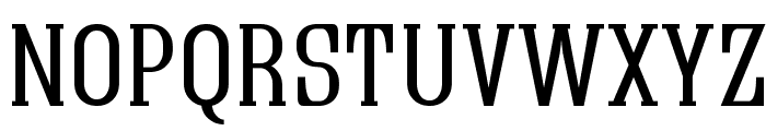
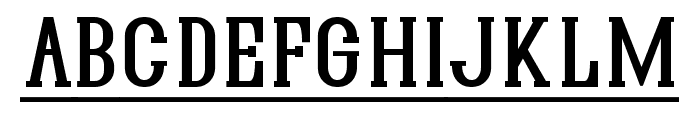
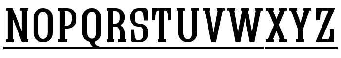
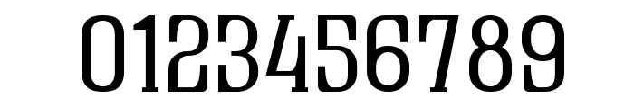
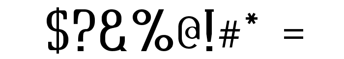
A bold, classic serif font with elongated characters.
This font features bold, elongated characters with a classic serif style. The strokes are consistent in thickness, providing a strong and authoritative appearance. The uppercase letters are prominent, and the numerals are distinct with a slight curvature.
Ideal for headlines, posters, and branding materials that require a strong, classic look.
Headlines, Logos
Balanced
Download Quastic Kaps Line font. Quastic Kaps Line by Copyright [c] Graham Meade,,, 2003. All rights reserved.
Ideal for headlines, posters, and branding materials that require a strong, classic look.
Headlines, Logos
Balanced
(Fonts by Apostrophic Lab)
See the font with your own custom text

Category
Serif
Bold
Yes
Italic
No
Weight
Bold
Width
Normal
Character spacing
Normal
Line height
Normal
Contrast
Low
Overall style
Classic
X height
Medium
Cap height
High
Proposed projects
Ideal for headlines, posters, and branding materials that require a strong, classic look.
Use case
Headlines, Logos
Ascender descender ratio
Balanced
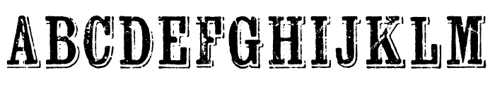
Similar Free Fonts for Quastic Kaps Line
Quastic Kaps Line Font

$ Free > Personal Use
Lockon Velline Font
$ Free > Personal Use
Similar fonts for Quastic Kaps Line from Adobe.com
Wausau Regular Font
$ Commercial > Adobe.com
Kiln Serif Spiked Font

$ Commercial > Adobe.com
Similar fonts for Quastic Kaps Line from MyFonts.com
Industrial Gothic Std Single Line Font

$ Commercial > MyFonts.com
Industrial Gothic Pro Single Line Font

$ Commercial > MyFonts.com
Similar fonts for Quastic Kaps Line from CreativeMarket.com
Lockon Velline otf (400) Font

$ Commercial > CreativeMarket.com
Knoxville Regular otf (400) Font

$ Commercial > CreativeMarket.com


Help your fellow font-seekers if you think you can recognize the font. Earn some good karma by doing it :-) Answer & Help
Yet sometimes the images are very complex, so other users need a bit of help.
If you recognize the font from the samples posted here don't be shy and help a fellow designer.
Thousands of designers (famous or not) use the image font detection system to find a font or similar free fonts from an image. Although we have the largest database of fonts, the search for a font from an image gets mixed results like the image above.