
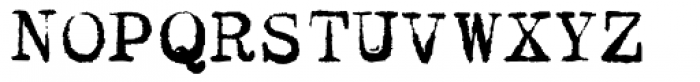
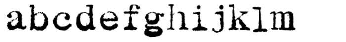
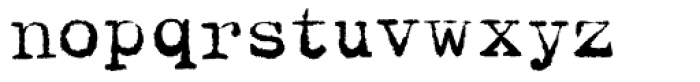


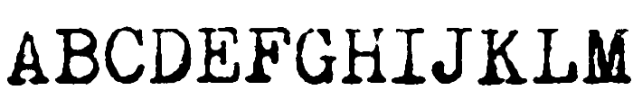
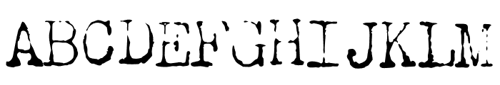
Dear John Uneven font
Publisher
MyFonts.com
License
$ Commercial
Date added
Dec 07 2016
A distressed, vintage typewriter-style font with a rough texture.
This font features a distressed, uneven appearance with a vintage typewriter style. The characters have a rough texture, giving them a worn, nostalgic feel. The uppercase and lowercase letters maintain a consistent style, while the numbers and special characters complement the overall aesthetic.
Ideal for retro-themed designs, vintage posters, and creative projects that require a nostalgic touch.
Headlines, Logos, Posters
Balanced
Download Dear John Uneven font.
Ideal for retro-themed designs, vintage posters, and creative projects that require a nostalgic touch.
Headlines, Logos, Posters
Balanced
See the font with your own custom text

Category
Decorative/Display
Bold
Yes
Italic
No
Weight
Bold
Width
Normal
Character spacing
Normal
Line height
Normal
Contrast
Medium
Overall style
Vintage
X height
Medium
Cap height
High
Proposed projects
Ideal for retro-themed designs, vintage posters, and creative projects that require a nostalgic touch.
Use case
Headlines, Logos, Posters
Ascender descender ratio
Balanced
Similar Free Fonts for Dear John Uneven
Remington Noiseless Font

$ Free > Personal Use
Sublev Font

$ Free > Personal Use
Similar fonts for Dear John Uneven from Adobe.com
Chandler42 Lite Font
$ Commercial > Adobe.com
Chandler42Regular Regular Font
$ Commercial > Adobe.com
Similar fonts for Dear John Uneven from MyFonts.com
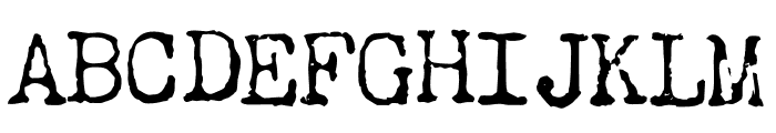
Dear John Uneven Font
$ Commercial > MyFonts.com
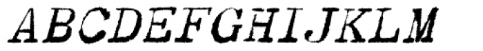
Dear John Uneven Italic Font
$ Commercial > MyFonts.com
Similar fonts for Dear John Uneven from CreativeMarket.com
ChristmasBlink otf (400) Font

$ Commercial > CreativeMarket.com
Psychofun Regular otf (400) Font

$ Commercial > CreativeMarket.com


Help your fellow font-seekers if you think you can recognize the font. Earn some good karma by doing it :-) Answer & Help
Yet sometimes the images are very complex, so other users need a bit of help.
If you recognize the font from the samples posted here don't be shy and help a fellow designer.
Thousands of designers (famous or not) use the image font detection system to find a font or similar free fonts from an image. Although we have the largest database of fonts, the search for a font from an image gets mixed results like the image above.